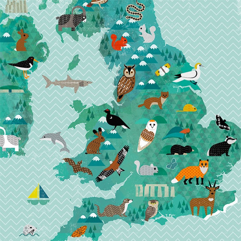
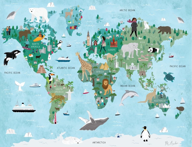
Illustrated Maps (more interesting and easier to read)
Most of us have had the same small failure. You’re in a new place, you open a map, and it gives you either too much or too little. The tourist map is cheerful but vague. The standard street map is accurate but busy. Meanwhile, your time leaks away at the kerb, turning in circles, trying to make sense of it all.
An illustrated map solves a different problem. It isn’t trying to measure every metre. It’s trying to help you understand a place quickly.
Done well, illustrated maps are faster to scan, easier for wayfinding, and more enjoyable to use. Better still, they stick in the mind. This post explains what makes them readable, where they shine (and where they don’t), and how to choose or create one people will trust.
Why illustrated maps are easier to read
A good map is a promise. It says, “I won’t waste your attention.” Illustrated maps keep that promise by showing priorities, not just streets. They guide your eye towards what matters, then they let you decide.
Think about how you actually move through a city centre. You don’t think in coordinates. You think in anchors: the station, the river, the big museum, the square with the cafés. Illustrated maps put those anchors first. As a result, you spend less time decoding and more time walking.
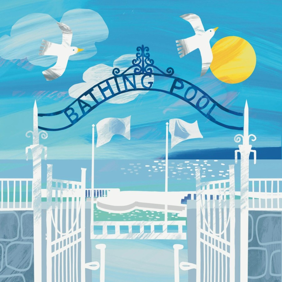
This is why they work so well in parks, museum districts, waterfronts, markets, and event sites. You don’t need every side road. You need the main paths, clear zones, and recognisable landmarks. A strong illustration can do in one glance what a paragraph of directions struggles to do.
Still, we should be honest. Illustrated maps aren’t for precise measurement. They’re for clarity and quick decisions. If you need exact distance, gradient, or a route that depends on every junction, a standard map will serve you better.
Visual shortcuts help you find places faster
Illustrated maps use visual shortcuts the way good signage does. Icons, simplified shapes, and colour blocks create a quick mental sorting system.
A few common examples show the pattern:
- A major station drawn larger than nearby buildings
- A river shown as a bold blue line, so you can orient yourself without hunting.
- Food streets marked with small fork icons, so you can choose a direction
Labels matter as much as drawings. Clear type, sensible spacing, and short names stop the map from turning into a word-search. When designers leave breathing room around key places, readers don’t panic. They follow the logic.
Accessibility belongs here too. Strong contrast helps everyone, especially outdoors. Tiny text helps no one. Also, colour should never work alone, pair it with symbols or patterns so colour-blind users don’t lose meaning.
Storytelling maps people actually remember
A standard map tells you where. An illustrated map can also tell you why.
That’s not decoration for its own sake. Story helps memory. You forget street names, because they’re abstract. You remember the sketch of a castle, a lighthouse, a theatre mask, or a line of trees. Pictures turn a place into a sequence of cues.
This is why illustrated maps work for history trails, wildlife walks, and neighbourhood guides. They can show character without pages of text. A harbour area can feel maritime. A market lane can feel busy. A cultural quarter can feel distinct. When the map carries that meaning, the walk becomes easier.
Imagine a simple walking loop: start at the station, pass the clock tower, cross the bridge, reach the museum, finish at the gardens. Each drawing acts like a checkpoint. You don’t just follow lines. You follow a story you can hold in your head.
Where illustrated maps work best
Use illustrated maps for exploring. Use standard maps for precision. That rule saves time and stops disappointment.
In print, illustrated maps shine when you need a quick overview on the move. On a phone, they work when zoom and layout keep the picture clear. Either way, they’re at their best when the reader needs confidence more than detail.
Perfect uses: tourism, events, campuses, and trails
Illustrated maps belong wherever people arrive as strangers and need to act quickly. They’re also ideal where crowds move in bursts and decisions must be made in seconds.
They fit especially well in:
- Festivals and markets, because people scan for stages, food, toilets, and exits.
- Theme parks and attractions, because zones and icons beat long lists.
- University and hospital campuses,landmarks help visitors stay calm.
- Trails and nature reserves, because points of interest matter more
- Town centres, because shoppers want clusters (food, shops, sights)
Watch-outs: too much decoration
The most common trap is scale. Many illustrated maps stretch or shrink areas to make space for drawings. Streets may curve less. Corners may shift. North might not sit at the top. None of this is wrong, but it must be signposted by design and by expectation.
Distance can also mislead. A path that looks short may take 15 minutes. A hill may feel flat on paper. If timing matters, check another source.
Then there’s clutter. Some maps confuse “illustrated” with “busy”. Too many drawings can bury the routes, the labels, and the basic facts. Beauty should serve function, not replace it.
Before trusting an illustrated map, make sure the essentials still stand out: a clear “you are here” marker, the main paths, a simple legend, and key facilities such as toilets, first aid, entrances, and exits.
How to choose or create an illustrated map
If you’re downloading a map for a weekend trip, you’re looking for legibility and coverage. If you run a venue, you’re taking on responsibility. People will follow what you publish. So the map must tell the truth, even when it simplifies.
Start with the user’s first question: “Where am I, and what’s near me?” Then answer the second: “What’s the easiest next step?” Everything else is support.
Design choices for both phones and paper
Clarity comes from restraint. A limited colour palette beats a rainbow. Simple icons beat detailed sketches. White space beats cramming.
On phones, structure matters even more. Consider split areas with zoomable sections. Add an inset map for the busiest corner, such as an entrance cluster or transport hub. If the map has a live update version, a QR code can link the paper to the current view without stuffing the page with text.
Inclusive design should be the default, not a bonus. Choose colour-blind friendly combinations, and add symbols so meaning doesn’t depend on colour alone. Keep labels plain and direct. People shouldn’t need local knowledge to understand “Visitor Centre” or “Main Gate”.